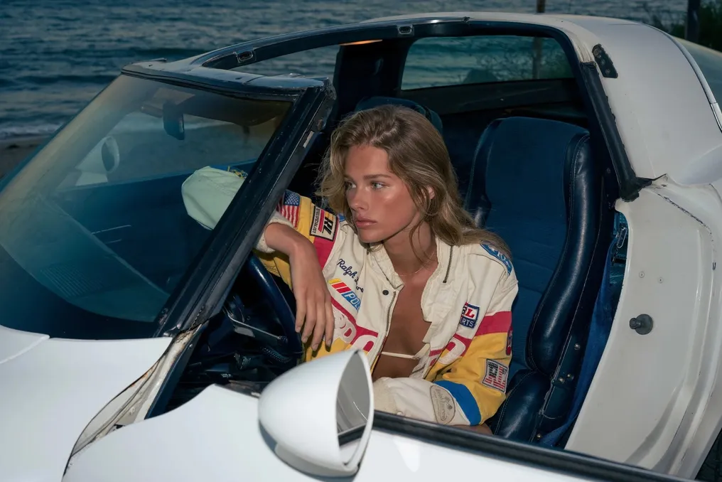
Racing Aesthetics Migrate to Pop Culture Through Graphic Elements and Design
Read more
FlatOut
flatout.com.br

Racing Aesthetics Migrate to Pop Culture Through Graphic Elements and Design

The author recounts a shift in interest from minimalism, which was initially motivated by resource optimization and maintaining organized environments, but later lost appeal due to being excessively devoid of personality. He argues that small objects, even without commercial value, carry personal stories.

This change in focus was driven by an aesthetic linked to the game FlatOut, specifically by racing icons, emblems, and stickers. The fascination lies in a particular graphic language—characterized by large, slanted letters, outlines, shadows, colored stripes, numbers, and geometric shapes—which is easily associated with motorsport but manages to transcend that context.

Historically, race cars were marked by national colors. This dynamic changed significantly in 1968 with the relaxation of sponsorship rules in Formula 1. Initially, a private Brabham displayed the colors of the Gunston cigarette brand at the South African GP. Subsequently, at the Jarama race in Spain, Colin Chapman's Lotus swapped its traditional British green for the red, white, and gold colors of Gold Leaf, leading to the creation of the Gold Leaf Team Lotus.

In the following decades, motorsport developed a strong link with the tobacco industry, with brands like Marlboro, John Player Special, Rothmans, Camel, Gitanes, and 555 building visual identities inseparable from notorious teams and cars. It is notable that much of this graphic repertoire originated from the advertising of products now restricted, but these brands continue to be appreciated on clothing and accessories for their aesthetic composition and association with the legendary era.

Besides cigarettes, companies producing lubricants, tires, auto parts, fuels, and additives contributed to a rich visual vocabulary. STP is cited as an example of graphic synthesis: its three white, slanted, and robust letters occupy a red oval outlined by a dark blue contour, conveying dynamism and contrast. When Andy Granatelli took over the direction of STP in 1963, he transformed motorsport into a branding platform, using a recognizable logo, a product, and the race itself as a reason for being, culminating in an iconic American identity after partnering with Richard Petty and his blue and red Plymouth in NASCAR.

Wynn’s presents a distinct style, with rounded and voluminous letters enveloped by oval stripes in shades of orange, pink, and purple, evoking the graphic advertising of the 1960s and 1970s with a psychedelic touch. This brand shares a visual continuity where text and frame seem to belong to the same language, being recognizable even without knowledge of its automotive additives.

Martini is a special case because the FlatOut visual identity was inspired by it. Its original symbol, created in 1925, consisted of a red circle cut by a black rectangle with the name Martini in capital letters. The blue, light blue, and red stripes used in Martini Racing were introduced to motorsport in the early 1970s. Its simple yet impactful composition uses parallel lines to create rhythm, red for contrast, and shades of blue for depth, functioning perfectly at any scale.

These three examples demonstrate how distinct visual identities can achieve immediate recognition: STP focuses on impact and condensation, Wynn’s on curved continuity, and Martini on geometric balance. None of them relies on a literal representation of speed; the meaning is constructed through the association of shapes, colors, and letters.

Typography plays a crucial role in this process, favoring heavy, condensed, or extended sans-serif fonts, often slanted. Numerals are also specifically designed to be recognizable. These choices communicate speed, solidity, and dynamism. Typographic families such as Microgramma (developed by Alessandro Butti and Aldo Novarese in 1952) and Eurostile (created by Novarese in 1962), along with Bank Gothic and DIN 1451, are references of this geometric and industrial aspect.

The application of these letters, with outlines, offset shadows, and overlaps, lends depth and three-dimensional movement without complexity, echoing the printed advertising of the second half of the 20th century, where logos needed to be legible on various media. Furthermore, visual psychology explains the appeal of these compositions. Studies indicate that the ease of composition organization influences perception, and in racing stickers, even with a lot of information, shapes and colors establish a visual hierarchy, following Gestalt principles.

Colors such as red, blue, yellow, and orange are frequent, often in saturated tones. A 2025 review study in the journal Psychonomic Bulletin & Review, analyzing over 42 thousand participants, correlated reds with greater emotional intensity, yellows and oranges with positive high-activation associations, and blues and greens with lower activation positive states. Although this is not universal, it shows studyable patterns for advertising use.

While there is beauty in observing a pure white prototype, free of stickers, there is also a distinct beauty in the moment when numbers, stripes, and supplier logos are added, giving the car a new identity that does not need to reflect the manufacturer's original appearance.

Similar stories

«Chepalett» Project: Combination of Chevette, Opala, and Kadett in Automotive Preparation
Read more
flatout.com.br

«Chepalett» Project: Combination of Chevette, Opala, and Kadett in Automotive Preparation

Many modern vehicles available in Brazil, such as VW Up, Renault Sandero, Onix, or Hyundai HB20, are frequently seen in daily life. Although some models may have factory characteristics that favor cornering dynamics, any experienced enthusiast knows that a well-executed project can transform even an unlikely car into a high-performance vehicle.

To optimize the speed of these cars, it is not necessary to worry excessively about the budget. There are popular recipes for engine replacement, such as in the Sandero, where it is common to apply the two-liter F4R engine, following a formula already used by Renault in the R.S. Furthermore, turbo modification is frequent, ranging from basic 'bakery' kits to more advanced solutions involving improvements in injection, flow, internal reinforcement, and ECU reprogramming.

The preparation scene in Brazil has evolved significantly, offering numerous options for those who want a well-performing car without needing to be an expert. However, it is possible to seek qualified workshops and professionals to ensure precise tuning and high speed, focusing only on driving.

This technological advance leads us to reflect on the past, when projects were notably more artisanal. There were fewer ready-made components and fewer parts developed specifically for each application, requiring enthusiasts to find ways to make what they had available work in the chosen vehicle. The workshop at that time functioned not only as a assembly site but also as a transformation of parts.

A crucial difference lies in the architecture of old cars. In these models, much of the assembly was relatively autonomous; the engine, gearbox, differential, suspension, and brakes had distinct particularities but did not depend on a vast network of electronic modules to operate in sync. A carbureted engine did not require a control unit to recognize its configuration, and replacing a mechanical assembly did not impose the need to convince the vehicle's original electronics about the inclusion of the new engine.

This characteristic explains the persistence of certain combinations in Brazilian preparation, such as the Chepala, which combines a Chevette with an Opala engine. Chevas equipped with GM Family I and Family II engines are also common. This does not imply that the adaptations are simple, but there is a relative freedom to combine these sets due to the absence of a complex electronic architecture that needs to recognize the swapped engine. Even with electronic injection, it is feasible to use independent management, such as a programmable control unit.

In contrast, in current models, a swap requires much more work. It is not enough just to install the engine and get it running; depending on the architecture, it is imperative to integrate electronic modules, sensors, safety systems, and even the gearbox. Electrical systems add complexities related to battery management, inverters, and thermal control, especially in intensive use like track days.

Although we today have access to more information and components that simplify the work, this does not diminish the merit of the old tuners, who had the charm of creating solutions that did not exist in the catalog. The Chepalett exemplifies this: a Chevette that integrated components from Opala and Kadett, in addition to parts from other Chevrolets.

The history of this project began in 1983, when a Chevette was prepared for the Brazilian Brands and Drivers Championship. The regulations allowed the use of the 'mixed-hot' engine, which consisted of a 1.6 Chevette engine with the Monza cylinder head. This was the engine used by the car driven by Fernando Rebellato, Roberto Azem, and José Ricardo Fiaminghi.

In 1986, the Chevette received a 2.0 GM Family II engine equipped with a turbocharger to compete in the Mil Milhas (One Hundred Thousand Miles), although the results were not extremely expressive despite the straight-line speed.

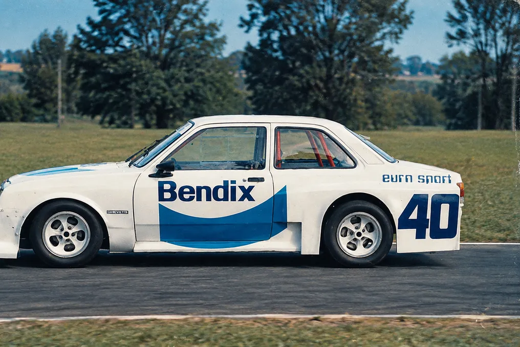
The ambition to improve the vehicle grew in 1987, when Rebellato and Fiaminghi, both General Motors engineers in Indaiatuba (SP), decided to use the Chevette for a more competitive project. They counted on the collaboration of GM colleagues and the support of EuroSport, a São Paulo workshop specialized in engine preparation and turbocharger installation.

The result was presented at the 1988 Mil Milhas. The car already attracted attention for its bodywork, which incorporated the complete front end of the Kadett, which was about 15 cm wider than the Chevette's, allowing for the use of larger wheels. An air vent was also created between the front fenders and the doors, with a finish so refined that the magazine Oficina Mecânica noted the similarity to an original factory model.

The fusion of Chevrolet was not limited to the bodywork. The engine was an eight-valve 2.0 Family II, mounted longitudinally, and it was a reinforced version, originally intended for export and used in the Pontiac Sunbird, with forged pistons and connecting rods and reinforced bearings. Using a Garrett T03 turbocharger, an intercooler in front of the radiator, and a Brosol 2E7 carburetor in a pressurized box, the estimated power reached 250 hp at 5,800 rpm, with about 35 kgfm of torque at 3,000 rpm. The turbo pressure in races was approximately 1 bar, potentially reaching peaks of 1.8 bar.

The gearbox was also taken from another model: it was the four-speed Clark from the six-cylinder Opala, chosen to withstand the high torque of the modified engine. Due to bore incompatibility, a flange had to be manufactured to join the two assemblies. The shift lever, however, remained the original Chevette one.

Besides the engine upgrade, there was the challenge of managing rearward force. The Chevette had a torque tube designed for about 15 kgfm, less than half of what the prepared engine delivered. The solution adopted was to replace the entire rear assembly with that of the six-cylinder Opala.

This choice also solved another vital point: the project used eight-inch wide alloy wheels, fitted with Pirelli P7 Corsa 225/55 R14 tires, identical to those used on Stock Car Opalas. The only detail was that the wheels had five bolt holes, while the original Chevette used four. With the Opala's rear axle, which already had five-hole hubs, this aspect was resolved.

At the front, the adaptation was more complex. Opala spindles, with their hubs and bearings, were used, while the original Chevette suspension arms were modified to accommodate the ball joints of the larger model. The steering box also needed to be adapted, combining elements from both vehicles.

Installing the Opala's rear axle demanded great effort due to the differences between the suspensions. The Opala used upper and lower arms and a Panhard rod, while the Chevette had a different mounting geometry. To accommodate the upper arms of the larger axle, the team developed specific supports for the rear floor, studying the anchoring points based on the drawings of both suspensions, and the first prototypes were made of cardboard to test movements before final production.

This process illustrates the spirit of the project: there was no marketable conversion kit. It was essential to deeply know both cars, understand the functioning of their suspensions, and manufacture a personalized solution to take advantage of the best of each, ensuring it was functional for long-distance racing.

The rest of the assembly received various components. Cofap shock absorbers, Axios suspension bushings, and Fabrini springs. Dana revised the rear axle and installed a locking differential, and the twin-piece driveshaft anticipated a solution similar to that used in the 1988 production Opala.

The preparation was not limited to mechanics. The fuel tank, with a capacity of 180 liters, was placed in the place of the rear seat, offering autonomy of about two hours with alcohol. The battery was relocated to the cabin, and the electrical system received a new and reinforced harness, with two ignition modules and two coils.

Upon finishing the car, the first challenge was at the 1988 Mil Milhas. During training, carburetion problems and pressurization hoses that came loose with heat and vibration arose. The transmission also presented difficulties: a gearbox failure almost prevented the start, and without a spare part, the team had to dismantle it and repair the damaged component with welding and manual adjustments. After the repair, Fernando Rebellato reported that the transmission emitted excessive noise, giving the impression that it would 'bite' the driver, but the team opted to proceed.

The Chevette finished the race in tenth place in the overall ranking, among more than 60 competitors. Although it was not an extraordinary result, it demonstrated the potential of the project. In 1989, a new participation ended prematurely due to a fire caused by fuel leakage in the Sergeant's braking area. The best performance was achieved in 1990, with new bodywork modifications, including the Kadett GS front end and fender changes.

Frugal Chic Trend Among Generation Z: How to Look Expensive on a Limited Budget
Read more
www.aajtak.in

Frugal Chic Trend Among Generation Z: How to Look Expensive on a Limited Budget

Fashion no longer means having to spend large amounts of money on expensive brands or designer clothing. A new fashion trend called 'Frugal Chic' is gaining popularity among Generation Z. The essence of this style is creating an appearance that looks expensive and stylish while spending minimal funds.

Within this trend, the emphasis is placed not so much on the cost of the clothing, but on its fit, quality, and styling method.

Frugal Chic is a fashion style aimed at creating an elegant and sophisticated look on a small budget. Instead of chasing expensive brands, people choose clothes that can be combined in various ways. Elements of this style include well-fitting shirts, black trousers, solid-colored tops, blazers, and simple accessories.

The modern Generation Z approaches their fashion spending very thoughtfully. Although new trends constantly appear on social media, buying expensive clothing for every fashion wave is not always feasible. Therefore, young people are looking for ways to look more stylish while spending less money.

Furthermore, this trend is supported by a growing interest in saving, buying second-hand items, and restyling existing clothes. Young people are now creating new looks using items from their old wardrobes instead of buying something new every time.

Achieving this look does not require spending a lot of money. Several simple methods can be applied:

  1. Choosing neutral colors: Colors such as white, beige, black, and brown lend sophistication and elegance to the look. Clothing in these shades is easy to combine with each other.
  2. Attention to fit: It is more important that the clothing fits perfectly than how expensive it is. A shirt, trousers, or blazer with the right fit can make a basic outfit stylish.
  3. Minimalist yet high-quality accessories: Instead of wearing many pieces of jewelry, one should choose simple and elegant items. Small watches, light earrings, and good bags can significantly improve the overall look.
  4. Combining and mixing: Instead of constantly buying new clothes, one needs to experiment with styling the items already in the wardrobe. The same shirt can be worn with trousers or jeans, creating a new look.

The goal of Frugal Chic fashion is not to look expensive through expensive purchases, but to look good through one's own taste and creativity on a modest budget. This is why this trend is becoming not only a fashion phenomenon but also a way of smart shopping for Generation Z.

Capricorn Horoscope for November 2, 2026: Financial and Health Recommendations
Read more
www.aajtak.in

Capricorn Horoscope for November 2, 2026: Financial and Health Recommendations

According to the horoscope for November 2, 2026, for the Capricorn sign, it is recommended to avoid lending money to anyone. It is also noted that negative thoughts may dominate one's mind.

Success is expected in competitive spheres, but caution should be exercised in business matters due to the possibility of financial losses. It is important to focus on current work tasks.

Regarding health, it is advised not to neglect minor ailments. The general forecast indicates the need for careful attention to one's well-being.

Popular