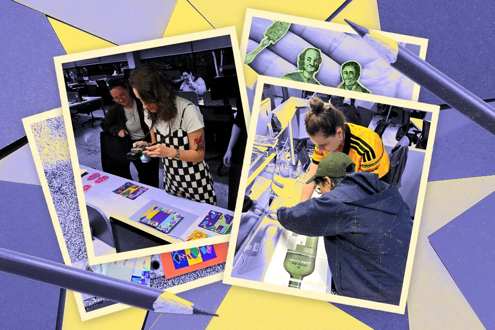
Super magazine stands out not only for its content but also for its visually rich and striking layout, which is the result of the work of its design team, who constantly innovate in representing reports with varied and creative artwork.
The images in the features can be generated by various methods, including illustrations, photography, collages, and 3D modeling. In many cases, the designers collaborate with reporters and editors, inviting freelance artists to create the visuals, always under the supervision of the Super team.
In the past, when print publication was more consumed, there was a larger budget and time to hire visual artists specialized in specific, often artisanal techniques. Although this desire persists, execution is more challenging today.
To determine the visual representation of an article, the art team considers factors such as time availability, financial resources, and existing skills, seeking the best possible alternative. Whenever feasible, the magazine tries to incorporate manual work into its design, which happens infrequently but brings satisfaction when achieved.
Recently, in the September issue of Super, two features were produced manually by the designers, which is considered unusual. One of these features, about absinthe, presents an even bolder and rarer approach: the text was laid out inverted on the page, requiring the reader to rotate the printed magazine by 90 degrees to read it.
Juliana Krauss, art editor, comments that, in her view, magazines are resembling vinyl records because the physical interaction with the object is a differentiator. She expresses the desire for readers to interact with the magazine, citing the absinthe case as an example where the reader is forced to rotate it to read.
Each designer details their creative process. In certain months, the Super art team goes through a period of intense inspiration, leading them to test unconventional approaches. One designer reported being affected by this period while working on Pamela's text about mental changes during motherhood.
Feeling that the theme required a more refined finish, the designer was inspired by a previous work from the neighboring magazine, VC RH, where Camila Leite created complete illustrations using felt layers. She consulted Juliana Krauss, art director, about the possibility of replicating something similar. Juliana Krauss already had experience with the proposed challenges, having accompanied the designer in the process of making paper miniatures of food for a feature on ultra-processed foods the previous year.
They decided that paper would provide the desired visual finish, opting this time for a 2D format with layers. A brainstorming process began with various ideas. After initial sketches, they decided to present the feature as a flipbook, where an illustration would be divided into sections affecting a central element.
After defining the scenes and objects, the designer created an illustrated version in Illustrator to facilitate visualization and approval by Rafa, the chief editor, and Ju. With minor adjustments, she separated the shapes into files, organized by paper color and required quantity for cutting. Although a cutting machine would have been more practical, she used a precision craft knife at home.
After a long period and a large volume of paper, the shapes gained cohesion by receiving layers, aided by masking tape. Upon finishing the assembly, the designer, along with Juliana Krauss and her camera, left the Abril Publisher's editorial office to find a suitable location and different lighting conditions to set up an improvised studio.
They opted to photograph separate backgrounds from the brains to have greater control in editing. Subsequently, in Photoshop, the images were merged and small details were adjusted, resulting in the material ready to be applied to the layout with the final text.
In her first experience at Super, four months after joining the editorial office, the designer received the absinthe feature in issue 491. Diving into this topic allowed her to learn about both the enigmatic drink and the production process of a feature at Super.
The initial research on absinthe sparked her interest due to the mystery surrounding the drink. She gathered historical and visual references, bringing this 'green aura' to Juliana Krauss, art director. The designer initially proposed that the opening page have a different orientation, such as portrait, forcing the reader to turn the magazine to read it, presenting an elegant label of the drink.
Juliana Krauss drastically expanded the proposal, suggesting that instead of just one page, an absinthe bottle should be presented crossing the three folds of the magazine, allowing the reader to observe it while flipping through the pages. The agreement was quickly reached.
Although the idea of using physical illustrations and collages arose early, the decision to adopt manual techniques only occurred after a digital sketch. In the process of collecting images for collage, the designer had the idea of creating the elements through pencil illustrations. Juliana Krauss agreed and suggested using colored papers in shades of green as a base.
The first test was simple but generated enthusiasm. The designer drew the components (bottle, cork, label, glass, sugar cube, and table) in her notebook, cut them manually, and assembled them next to Juliana Krauss's desk. In the same week, a second prototype was presented on colored paper, with colored pencil and ink illustration, on a smaller scale, to evaluate the overall style.
The initial tests differed from the final result, as the project evolved with each learning and feedback. The designer also learned about technical aspects, such as light, shadow, proportion, and texture, which were previously just hobbies. She fell in love with the green tone, acquiring several shades in stationery stores and art supply shops. Furthermore, Carol, who wrote the other half of the text, provided more green tones from her stock for the motherhood feature, integrating elements from both reports.
She discovered the best coloring technique: applying an intermediate shade of colored pencil, followed by a darker shade to give shape, another even darker shade for shadows, and a very light shade to highlight the light, finishing with black pencil. This process added textures, and each type of paper reacted differently to the layers of pencil.
Throughout the development, Krauss sought to implement the layout in a vertical orientation, which contradicted the magazine's standard. With each advancement, a printout was made to check readability and structure, and to decide which elements to add to the scene. The suggestion of a fairy and decorative dots came from Rafaela Reis, a colleague of the art team who works on other brands at Editora Abril.
With about 90% of the elements ready, the scene was set on a black background, with the cut-out drawings attached with masking tape, and photographed. At that moment, the perception of proportion changed, revealing that some elements were too large or had variations in color and texture.
Despite the photographic efforts, it became clear that significant post-production work with the help of Photoshop would be necessary. The image treatment performed by Juliana on the computer corrected the flaws of the manual work, allowing digital textures to be reinforced to emphasize that the illustration was handmade, fulfilling the intention of valuing artisanal work.
It was concluded that the biggest learning was understanding that manual and experimental work does not mean a lack of criteria. It is possible to make mistakes, correct, and improvise, but always maintaining direction, testing, and adjustments. It was through this process of small-scale testing, identifying flaws, and corrections (manual or in Photoshop) that the feature took shape, a result of a valuable exchange with Krauss and the entire involved team.