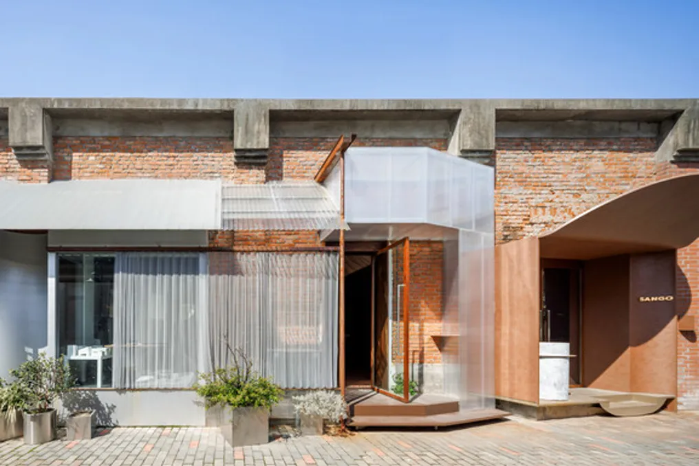
In 2024, Modum Atelier moved its office to Guochuang Park. Due to the company's projected growth for 2026, more space became necessary, leading to the decision to occupy the adjacent void. Using its own headquarters as a testing ground, the team experimented with a complete urban renewal process, adopting an incremental and unplanned transformation methodology. The approach sought to understand the space from the perspectives of both the designer and the user, focusing on aspects such as continuity, legibility, and the existing environment.
The initial design of Office 1.0 was inspired by Venetian architecture and oriental gardens. Maintaining this line of reasoning, the team revisited Venice and drew inspiration from the INAIL building, designed by Italian architect Giuseppe Samonà. The facade of this two-story building is structured by pilasters of varying sizes: the widest act as structural support, while the thinnest compose the building's 'skin.' Through contrasts in light, shadow, and color, the facade abstractly evokes Venetian architectural tradition. The juxtaposition of these two layers generates a vibrant and shimmering visual effect, a luminous ambiguity that the project also aimed for.
For the new meeting room facade, a material with similar industrial characteristics but a distinct texture was chosen: translucent polycarbonate panels. This choice was made to prevent the facade from becoming excessively heavy and robust, as would happen with silver-gray aluminum, instead conferring a sense of fluidity.
The roof serves to unite the old and new volumes. It was intentionally extended to make visible the temporal difference between the two interventions, rather than trying to hide it. The new roof employs corrugated polycarbonate panels, whose transparency differs from the pre-existing corrugated aluminum panels, although it maintains the formal logic of the original, resulting in a relationship of distinction and continuity.
To soften the transition between materials, a sliding metal curtain was added to the facade, functioning as a subtle veil over the union of components. The combination of aluminum panels, exposed brick, and polycarbonate establishes a softer and more ambiguous material transition. Thus, the objective was to honor and transparently expose the vestiges of each period, consolidating all elements into a cohesive whole.
The building where the studio was located was originally part of the Jiangnan General Mint of Casting Silver, a set of single-story structures built with modular brick and concrete bays. The new expansion accommodates three functions: reception, meeting, and exhibition. Due to heritage preservation regulations and the existing structure, the layout could not undergo major changes, needing to preserve its original spatial configuration. However, it was important that the expansion did not interfere with the daily operation of the office. These limitations drove a 'micro-intervention' strategy and the adoption of the spatial archetype known as the side chapel.
In Italian churches, side chapels are independent prayer spaces along the main aisles, often delimited or enclosed for private devotion. They were typically requested by families or individuals for the veneration of specific saints and could be expanded by wealthier families to reach the scale of full chapels. The inclusion of side chapels is a common feature in religious architecture, present in monasteries, memorial buildings, and funerary architecture. Essentially, the side chapel generates a strong sense of belonging in a very restricted space. Inspired by this model, the goal was to translate its spatial logic into the new workspace.
The side wall of the existing office was redesigned, incorporating the access door to the new space into the wall panel. Steps made of rough stone placed in front of the door discreetly signal the entrance, echoing the reserved access of a side chapel. To manage the reduced width and high height of the new space, a secondary ceiling structure was implemented: the fabric is fixed at three points on the walls and the ceiling, creating an accentuated gable cover reminiscent of the drape of fabric. The recessed lighting makes the ceiling appear suspended. It is relevant to note that this sloped ceiling does not follow the pattern of traditional side chapel ceilings, which usually have coffered flat ceilings; rather, it is inspired by the form of a common rural chapel roof, thus being a formal transfer.
The interior walls were clad with panels painted with automotive paint in a reddish-brown tone, maintaining a height of 2.3 meters to establish a human scale. The continuous use of this material provides a uniform and clean wall surface, reinforcing a feeling of warmth. Other materials used include reclaimed wood flooring and Corten steel frames. Despite maintaining distinct individual textures, the materials were chosen so that their colors fit into a close palette, combining shades of reddish-brown, brick red, and cherry wood to form a harmonious visual composition.
An incremental and unplanned transformation resembles an improvised performance without a script, full of uncertainties. However, it is precisely this nature that can make it remarkably interesting. During the construction of the office expansion, the opportunity arose to extend the project to the neighboring void. The final module of the sequence, adjacent to the new office space, changed tenants, and the owner hired the team to design an Italian gelato shop. This provided the opportunity to create a continuous facade, following the logic of architectural restoration and maintaining a clear relationship between the old and the new.
The entrance hall was conceived as a 'metallic element' with a curved roof. The upward movement of this roof dialogues with the relationship to the office, establishing a dynamic balance along the facade. The hall component rotates towards the right, facing the small square in the empty plot. The shop primarily sells artisanal fruit ice cream, and the owner, who is a graphic designer, conceived the concept of a continuous 'fruit pool.' This idea was adapted into a shape resembling a baptismal font, traditionally found in church entrances, which ended up mirroring the experience of entering the side chapel, subtly transferring the ritual of 'purification before entering' to an everyday commercial context.
Conclusion
The renovation presents itself as a complex, unpredictable, and full-of-potentialities process. Faced with multiple possible paths, the team selected one and integrated all 'interfaces.' It was possible to respond to the vestiges of different eras with honesty and flexibility, culminating in a state of dynamic equilibrium.