At the UN General Assembly on September 4, 164 votes to one were cast to urge the global community to abandon the use of Gerardus Mercator's 1569 projection—the map studied in schools worldwide.
The non-binding resolution, put forward by Togo for the African Group and the African Union under the slogan 'Fix the Map,' recommends using the Equal Earth projection instead.
Six countries abstained from voting, including Ukraine, which objects to how the Equal Earth map depicts Ukrainian territory occupied by Russia. The US cast the single dissenting vote, and its representative in ECOSOC, Yarina Ferentsevich, called the resolution a 'radical ideological project.'
Togo's Foreign Minister, Robert Dussay, stated at the meeting that 'a fair map does not change the geography of the world; it changes how we see the world.'
Size of countries on the map
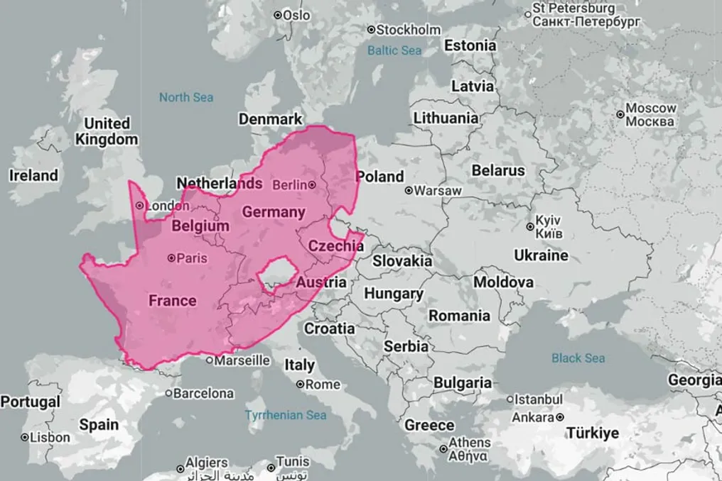
South Africa covers an area of 1,221,037 km², making it the 24th largest country on Earth and the ninth in Africa. This area is twice the size of France and five times the size of the United Kingdom.
Mercator maps do not shrink South Africa; on the contrary, they distort it. The distortion of the area in this projection increases proportionally to the square of the secant of the latitude, so in our mid-latitude region, approximately 29° south latitude, we are depicted about 31% larger than we actually are.
However, the problem is that many other countries receive an even greater 'bonus,' depending on their position on the curve. The contiguous United States, located around 39° north latitude, is enlarged by about two-thirds. China, located around 35° north latitude, is inflated by about half. Alaska, located at 64° north latitude, is shown more than five times its true area. Among the giants, only India, located around 22° north latitude, receives less exaggeration than South Africa, by about 16%.
More than they are
The distortion is not that South Africa looks small. The problem is that the countries we compare sizes with look much bigger than they are, while equatorial states, with which we share the continent and through which railways and cables run, are depicted accurately and thus seem insignificant. For example, the Congo basin is not distorted at all.
Africa itself covers 30.3 million km², which accounts for about one-fifth of the world's landmass, encompassing 54 countries. This is about 14 times larger than Greenland, which Mercator depicts as nearly equal.
Nevertheless, the debate remains unresolved and may never be resolved. A week before the vote, Google Maps began showing Lake Ontario as 'America Lake' to users within the US after signing an executive order on August 27 and its adoption by the US Geographic Names System. Users in Canada still see Lake Ontario.
Ontario Premier Doug Ford responded with a huge billboard on the Canadian shore in Vaughan: 'Lake Ontario. Now and forever.' On Google Maps, South Africans—and presumably people from other countries besides the US—still see Lake Ontario. However, the Gulf of Mexico is displayed as 'Gulf of Mexico (Gulf of America)' for users whose maps are not located in the US. This is the reality of world cartography: not one authoritative picture, but a geolocation provided by IP address, which somewhat weakens the idea that a UN vote can create a single map.
Mercator remains the default setting on the platforms we use daily. Almost all digital maps—Google Maps, Apple Maps, OpenStreetMap, and delivery apps built upon them—draw the world in a version called Web Mercator. This is maintained for good reasons: it preserves shapes and angles locally, north is always up, and it neatly divides into square tiles. It is an excellent road map, but a poor world picture.
However, almost no one who creates real infrastructure uses it. And strictly speaking, your phone does too. Satellite positioning systems do not use flat maps at all. They operate based on latitude and longitude on a curved model of the Earth, and the flat image on the screen is created later. South Africa has its own real-world reference system: Hartebeesthoek94, used since January 1, 1999, fixed at the radio astronomical observatory outside Pretoria that gave it its name. Topographers work on a grid built on this system: it is a kind of Mercator, but local and accurate because it never tries to depict the entire world at once.
Submarine cable planning is similar. Cable maps circulating in the network are diagrams, not routes. Real paths are the shortest lines across the curved Earth, and the actual distance is what is paid for.
In orbit, where Amazon Leo is headed for launch in 2027 under Herotel licenses, what the satellite can cover depends on how much land it covers. Mercator exaggerates distant north and south—physics does not do that. Satellite coverage, fiber optic networks, cable routes, and railways have never been built according to Mercator.
Acknowledging this, it should be noted that Mercator was never a true lie. It was created for one purpose—to allow a sailor to maintain a constant compass course in a straight line, and the stretched sizes were the price of this trick. The mistake was hanging it on a classroom wall.
}} , 2. {