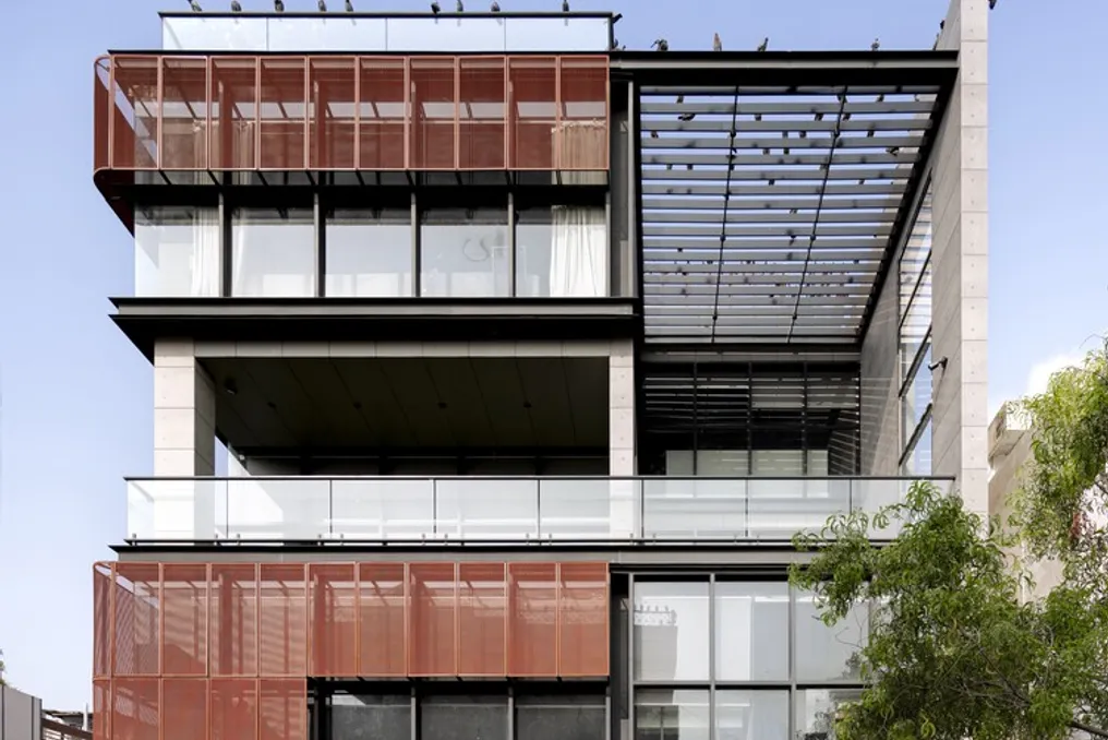
Screened Space, which serves as the headquarters and experience center for an electrical switch company, is located in the dense historic center of Vijayawada, Andhra Pradesh. The project was conceived as an architectural solution to address the complex characteristics of the local urban environment, marked by narrow streets, exposed infrastructure, and extremely close buildings, almost without setbacks.
Faced with this scenario, the design sought to establish a notable presence, finding a balance between visibility, climate control, and privacy assurance. The building occupies a corner plot in the commercial zone, placing it under the influence and gaze of two busy roads, requiring it to be easily recognizable in a visually charged context.
To solve this issue, the project fragmented the built mass using double-height volumes and internal courtyards. Since the longest facade of the building faces directly onto the neighboring street's line of sight, the design required a unique visual identity for the office block.
Spatially, the building distributes the experience center on the ground floor and first floor, while the work areas are located on the upper floors. This arrangement allows the project to interact with the street openly at the pedestrian level while keeping the environments of the upper floors controlled. Courtyards and voids with double height were incorporated into the structure to allow the penetration of natural light and create semi-open spaces that encourage informal interaction in the workplace.
The arrangement of these areas adheres to the precepts of Vastu Shastra, concentrating the densest and most built zones in the southwest quadrant, while the lighter and more open areas are directed towards the northeast.
At the ground level, the building creates a direct visual link with the street through an inclined glazed facade, exceeding seven meters in height along its shortest dimension, keeping the experience center accessible to the public. In contrast, on the longer facade, a solid wall conceals the existing infrastructure, offering privacy in response to the adjacent street's line of sight, rather than exposure.
On the upper floors, the building's enclosure was determined by its solar orientation and the use of space. Given that most of the work areas receive direct southern sun exposure, a custom double-skin facade was developed to reduce heating while simultaneously ensuring privacy.
The modulation of the metal brise-soleil was adjusted to the scale of the building. The mesh is composed of panels and organized in a two-layer system on each level, which contributes to reducing material waste and gives lightness to the edifice, making it appear like a textured veil rather than a rigid and monolithic surface. A constant air cushion is maintained between the glass frames and the metal mesh layer to optimize thermal performance.
The distribution of perforated panels was guided by the demands of the internal program: sectors with greater solar exposure received a denser pattern, while others remained more open. Certain sections lack enclosure to preserve direct visual connections between the interior and exterior without compromising environmental comfort.
Since no specialized facade consultancy was hired, the hardware details were resolved in close cooperation with local joinery suppliers, through the development of several prototypes on the construction site itself. A specific fixing detail was created to install the metal mesh panels directly onto the mullions of the structural glass skin system, which ensured positioning flexibility along the facade.
The proportions of the aluminum profiles were then calibrated with precision through repeated tests to achieve the necessary structural stability without increasing the visual thickness of the components. Material selection throughout the project prioritized durability, ease of maintenance, and suitability to the context. A restricted palette of glass, aluminum, and ceramic surfaces was adopted to ensure the longevity of the construction in a dusty urban environment, where continuous maintenance can be challenging.
Painted finishes were avoided in favor of anodized or powder-coated metals, and ceramic coverings replaced more fragile materials to minimize wear over time.
Beyond the architecture itself, the project extended to developing a broader corporate visual identity for the company. The combination of the red, gray, and black color palette, along with the use of metallic elements and modular systems, served as the basis for a corporate standard that can be replicated in future showrooms and offices. Internal elements, such as partitions, ceilings, and workstations, follow this same language, allowing the project to serve as a model for future brand expansions.
What characterizes Screened Space is not a single formal gesture, but rather the way multiple challenges were solved in an integrated manner. From the initial volumetry to the treatment of the facades and the choice of materials, every design decision was guided by the need to harmonize visibility, climate, and functionality with the complex urban reality, culminating in a building that stands out in its surroundings through a singular system of layers and visual filters.