The initial goal of creating Instagram has changed significantly. Initially, the platform was a place where users primarily shared photos. However, with the changing times, the emergence of TikTok, and the influence of Snapchat, Instagram began integrating short video features. As a result, photos gave way to short videos, leading to increased time spent by users in the app.
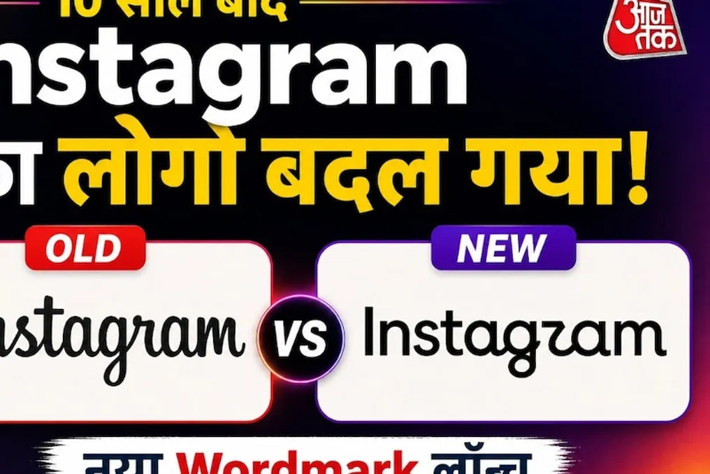
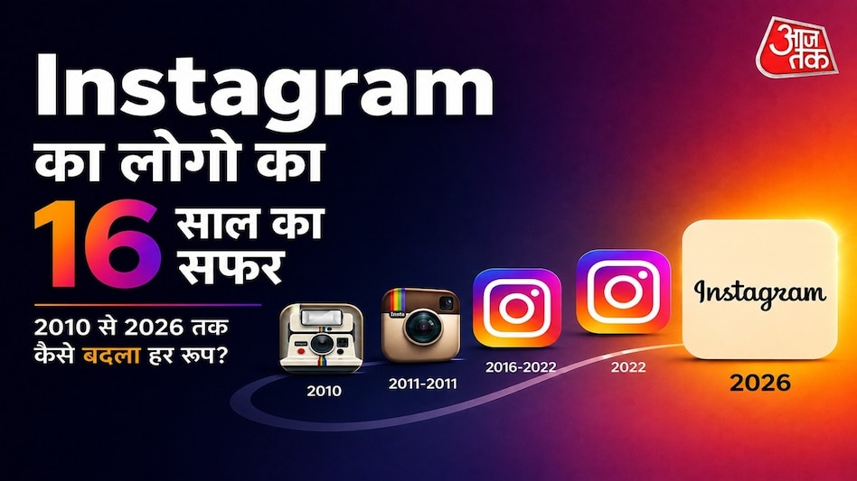
Instagram, which started with an image of an old camera, has transformed into one of the most recognizable social media brands globally. Throughout this journey, its logo has undergone numerous transformations. It evolved from the appearance of a real camera to a retro design, and in 2026, the company updated its wordmark after almost ten years. This raises the question: why did Instagram change its logo every time, and what was the idea behind these transformations?
The ability to instantly recognize the application by its icon, even without the name, is a huge advantage for any major brand. But achieving this level of recognition required a long journey for the Instagram logo. Interestingly, the original look of the logo bore no resemblance to what we see today.
Instagram was launched in October 2010. Its logo then differed greatly from the modern, clean app icon. It was an imitation of an old instant camera, displaying the camera body, lens, flash, and other small details. This first logo was created by Instagram co-founder Kevin Systrom. The design aimed to realistically depict the camera, which aligned with the contemporary trend in app design known as skeuomorphism—representing digital objects as real-world items.
However, this logo had a drawback: it looked too much like a real camera. Reports suggest that this forced Instagram to transition to a different design later on.
Soon after, Instagram hired designer and photographer Cole Rice. Rice developed a new icon inspired by the 1950s Bell & Howell camera. Bell & Howell was an old American company known for producing film and photographic equipment in the 20th century. This design was simpler than the previous one but retained the feel of a vintage camera. Key features included a large lens, a top viewfinder, and a central rainbow color strip.
There is a very interesting point here: at the time, Instagram was mainly a photo-sharing application, and one of its key features was photo filters. Users used Instagram to give their new pictures the look of old film and old cameras. Therefore, the retro camera-style logo was not just a beautiful design; it was directly connected to the product of Instagram during that period.
In 2011, Instagram slightly modified this camera icon. Additional details were added: the brightness and depth in the lens increased, textures resembling leather appeared on the top, and the rainbow strip became clearer. Thus, the camera looked more realistic than before. This logo remained the symbol of Instagram until 2016, a period of rapid platform growth, and became recognizable to millions of users. Then, in 2016, the company changed its logo again.
In May 2016, Instagram replaced the old camera icon with a very simple icon. It featured a gradient of purple, pink, orange, and yellow in the background, while the camera silhouette itself was rendered in a white line. Today, this design is so well-known that for the new generation, it is Instagram. Nevertheless, the public reaction to this 2016 change was mixed. Many preferred the old brown camera, and the new logo sparked jokes on social media, with some users calling it a change that would destroy Instagram's identity. At the time, this design shift was heavily discussed in the media.
However, the company did not make this decision suddenly. The company's then Head of Design, Jan Spalter, and his team worked on this issue for a long time. The main question facing the team was how to transform Instagram's old identity while preserving it, yet preparing it for the future. To achieve this, Instagram asked its employees to complete an interesting task: recall and draw the Instagram icon in five seconds. Most people drew three elements: the rainbow, the lens, and the viewfinder. The Instagram design team used these three elements as the basis for the new design. The full image of the old camera disappeared, but the idea of the camera, the lens, and the rainbow remained in the new design. Thus, Instagram did not erase its identity but simplified it into a simple symbol. This change affected not only the app icon; in 2016, the overall look of the entire application was also changed, and the internal interface became cleaner and black-and-white.