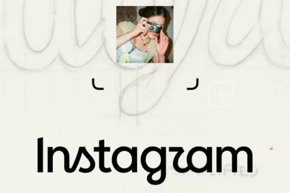
Instagram announced on Thursday, the 13th, a complete overhaul of its visual identity, marking the platform's first major redesign in a decade. This update covers modifications across various aspects, such as typography, colors, graphic elements, animations, and the logo.
Adam Mosseri, Instagram's director, presented this change as part of a new phase for the social network. The stated goal is to maintain references linked to the app's creative origins while adopting a more modern and versatile aesthetic.
The redesign affects the brand's visual system, keeping the camera as the focal point of the symbol. The company emphasizes that the update aims to highlight community creativity and keep pace with the various formats and experiences offered by the application.
One of the most notable changes lies in how the name Instagram is presented. While the previous version had more elaborate strokes, the new approach employs a typographic construction perceived as cleaner and more contemporary. The camera icon has also been redesigned, preserving the association with photography, a central element since the platform's inception.
The color palette has received adjustments to increase the dynamic feel of the identity. Furthermore, the system has gained a specific language for movements and animations, along with graphic elements designed for various applications within the service.
According to Instagram, the renewal transcends just the logo's appearance, encompassing a broader range of visual resources, including colors, typography, and movement, all intended to give cohesion to the brand. The company associates this new stage with the app's strong historical creative character, seeking to recover artisanal aspects of its roots without compromising compatibility with its continuous evolution.
The transformation of greatest impact occurred in 2016, when Instagram abandoned the representation inspired by old cameras to adopt a minimalist symbol accompanied by the colorful gradient that characterized the network during the following decade. The platform was launched on October 6, 2010, by Kevin Systrom and Brazilian software engineer Mike Krieger, and in its early days, its visual directly referenced old photographic cameras.
Thus, the current reformulation once again alters the visual presentation of the service, but without completely breaking from its origin. The camera symbol remains present, now integrating into a more comprehensive and flexible brand system.