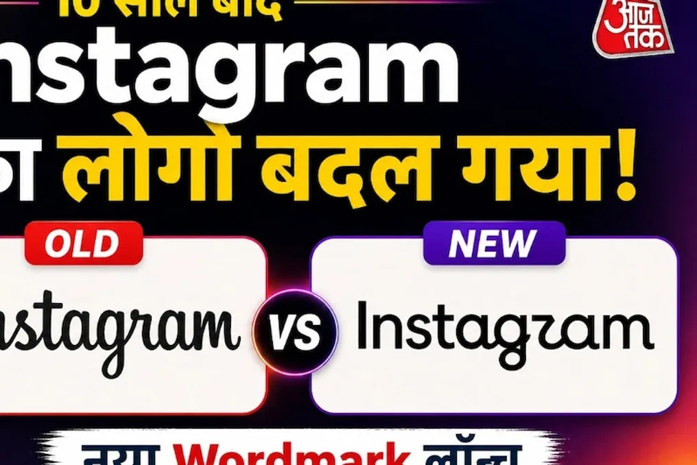
Instagram has changed its signature text logo, which had not been updated for about ten years. Although the new design is intended to make the look more modern and clean, debates and trolling have begun on social networks. Some users approved of the new look, while many noted that it lacks the former recognizability of Instagram. Some jokingly started calling it 'Instagzam.'
It is important to understand that the company did not announce a change to the entire app icon. The changes primarily affected the written word Instagram, which is used as a brand within the application itself. This part of the company was updated after approximately ten years.
Those who have used the service for a long time easily recognize its inscription. For the last decade, the name Instagram was displayed in a special cursive, handwritten style. Now, Instagram has changed this style. The new text mark is a combination of the old cursive design and standard printed letters. The company aims to keep the design cleaner and more modern, yet connected to the previous style.
Adam Mosseri, head of Instagram, commented on this change, noting that the text mark visible in the app had not changed for ten years, and it was time for an update. The company claims that the new design is more modern and clean while still retaining a hint of the old Instagram style. The goal is not a complete transformation of Instagram's identity, but its modernization in line with contemporary requirements.
The situation becomes interesting when a new design appears, provoking mockery on social networks due to its lettering. Many users noticed that the new name at first glance resembles 'Instagzam' more than Instagram. Some find the styling of the middle letters particularly strange. Discussions about the new text mark are actively taking place on Reddit: some consider it unsuccessful, while others note its cleanliness and modern appearance. Thus, opinions online are divided.
This is a typical problem for any large brand when changing its logo. It is not enough for the company to look beautiful; the logo must be instantly recognizable.
Instagram updated its text logo during major design changes in 2016. At that time, the overall look of the application also transformed, and the camera icon became simpler and brighter. After that, the cursive text mark of Instagram gradually became an integral part of its image. Since people saw the same design for a long time, the name Instagram became ingrained in their minds in that specific style. Therefore, even a small change in the letter style causes a strong perception of this update among people.
The company considers maintaining recognizability equally important. The Instagram camera icon remains one of its strongest recognizable features. Even when Instagram conducted a major visual update in 2016, the company did not completely eliminate the old camera idea, but merely gave it a simpler and brighter look. In this instance, the changes appear more limited: Instagram updated its writing, but did not undergo a transformation that could be considered a full rebranding of the entire application.
Adam Mosseri, head of Instagram, anticipated public reaction to the new text mark. He shared it on Threads and asked users for their opinions. As often happens with the change of logos of large brands, the internet immediately reacted: some praised the new design, some preferred the old one, and some began creating memes based on the new letters. The joke about 'Instagzam' quickly became popular on Reddit.