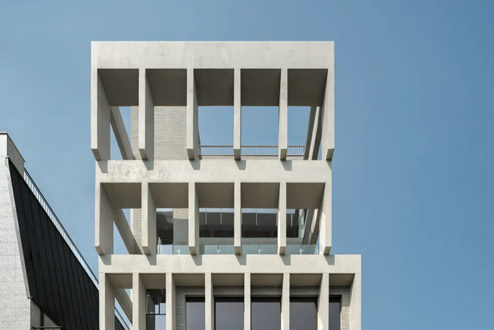
The design team described the site of the HOURS Commercial Building, located in a narrow alley less than six meters wide. This plot faces the Daehyeon Elementary School to the south and is near the Hwimun High School and Samseong Station to the north. This unique location favors uses such as educational facilities or corporate offices that prioritize parking over street visibility.
The open facade provided by the adjacent school is considered an advantage but necessitates careful management of both visual privacy and noise levels. The client desired a building that was highly functional and flexible, capable of meeting local demand while respecting the existing context.
From the outset, the project approach focused on renovation rather than new construction, with the clear objective of reducing costs, decreasing execution time, and minimizing any negative impact on the neighborhood.
The architectural team at See Architects identified three central challenges in the undertaking. The first was maximizing marketable area: this was achieved by adding two floors vertically through increasing the utilization coefficient, without altering the projections of the existing floors, which avoided high expenses for updating fire safety systems. The new upper floors were designed with a ceiling height exceeding four meters, and the original pilotis structure was maintained to ensure spaces for up to eleven vehicles, raising the utilization coefficient to 230%.
The second challenge was visibility. Since the old building was less than three meters from the lot line, there was a risk of being obscured by future neighboring developments. To resolve this robustly, See Architects extended a concrete portico, accentuating vertical and horizontal lines, to the exact limit of the land. This new space created between the portico and the building functioned as an intermediate zone between the architecture and the city, also acting as a psychological and visual barrier relative to the school located to the south.
The third point addressed was efficiency. By limiting the demolition of primary structural components, both the timeline and cost of the work were reduced by less than half compared to a complete reconstruction. The decision for renovation was strategic. Exposed concrete finishing was applied to the portico elements, while gray ceramic bricks covered the surfaces of the pre-existing building. This material distinction helps make the structural logic legible and differentiates the building from the surrounding residential environment, which is made of red bricks.
Initially, the planned portico was a freestanding vertical wall set two meters away from the facade. However, during the licensing process, regulatory authorities expressed concern about the unauthorized enclosure of this intermediate space. The See Architects team managed to turn this limitation into an opportunity: the portico was redesigned to start integrated with the facade on the lower levels and progress gradually on each floor. Thus, what was merely a vertical element began to resemble a three-dimensional urban sculpture, viewed as a rhythmic front grid and a distinct volumetric presence.